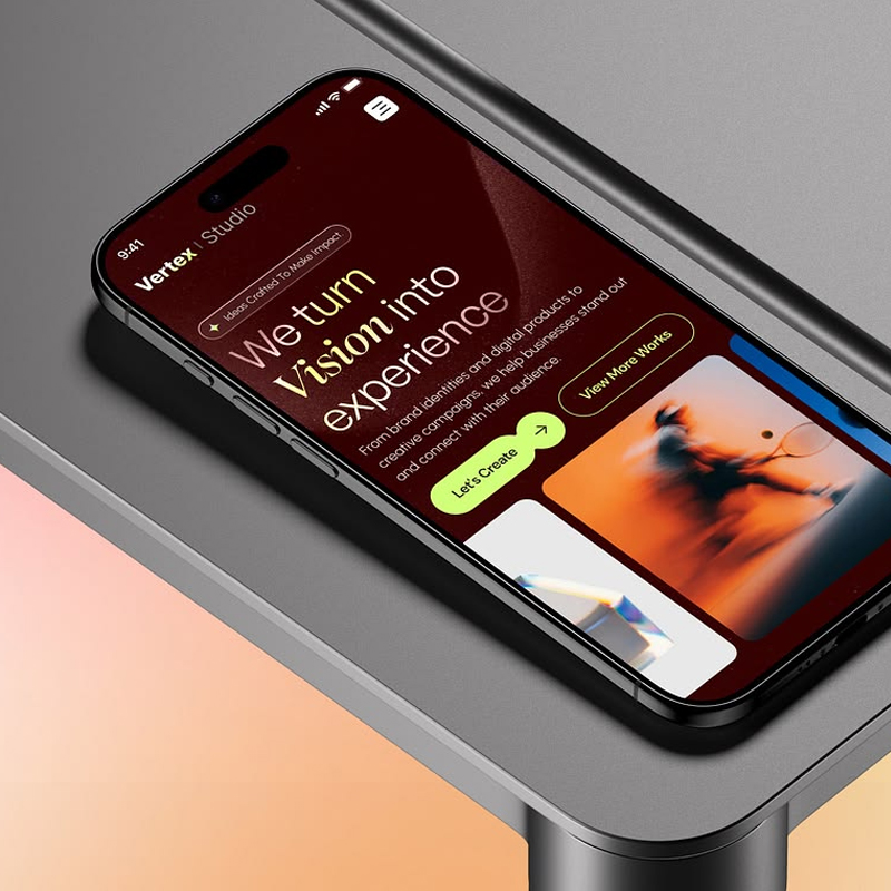
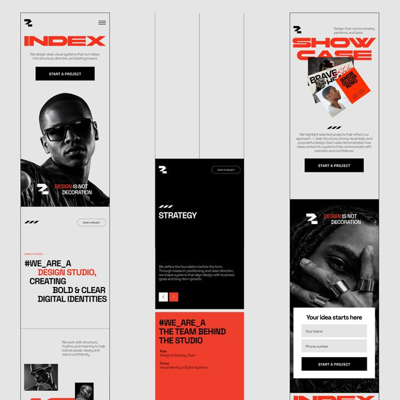
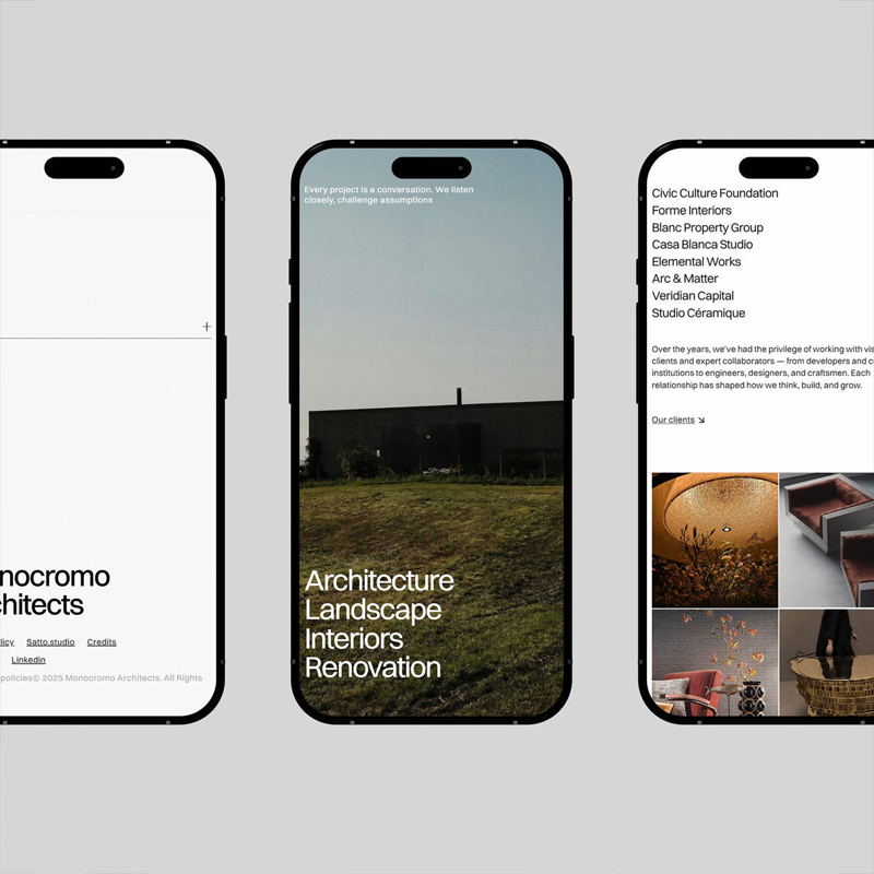
MOBILE RESPONSIVE DESIGN




Explore our capabilities
ADAPT
REFINE
TEST
Choose a plan built around the service you’re looking for with the flexibility to scale as your business grows.
Meta web labs transformed our brand identity far beyond what we imagined. The attention to detail and creative direction were exceptional. Working with them felt seamless, professional, and truly collaborative.
Our website redesign was handled with impressive skill and clarity. The team understood our goals and delivered a modern, high-performing site that boosted customer engagement. Highly reliable and results-driven service.
Their design expertise helped our business stand out instantly. Every element from colors to layout felt intentional and perfectly aligned with our brand. We’re extremely satisfied with the quality and speed of delivery.